
The lie factor.
Quantifying the degree of distortion

Graphs and visual explanations of data can be excellent tools for communicating evidence - but they can, if not used correctly, distort the evidence and deceive the reader. Very few people have more to say on this subject than American statistician Edward Tufte. Tufte was so committed to this idea that he took out a second mortgage to get his now classic text “The Visual Display of Quantitative Information” in print. One of his principles of graphical integrity are;
“The representation of numbers, as physically measured on the surface of the graph itself, should be directly proportional to the numerical quantities represented.“
In other words, graphs must tell the truth. He even coined a measure or factor to quantify the degree of distortion; “the lie factor”. The lie factor is the size of effect shown in a graphic divided by the size of the effect on which the graph is based. If the lie factor of a graph is larger than 1, the graph is exaggerating the size of the effect. A lie factor less than 1 would mean effects are diminished or downplayed.
The figure below is a graph depicting excess mortality due to hot and cold weather - it is taken from an article published in The Lancet Planetary Health.
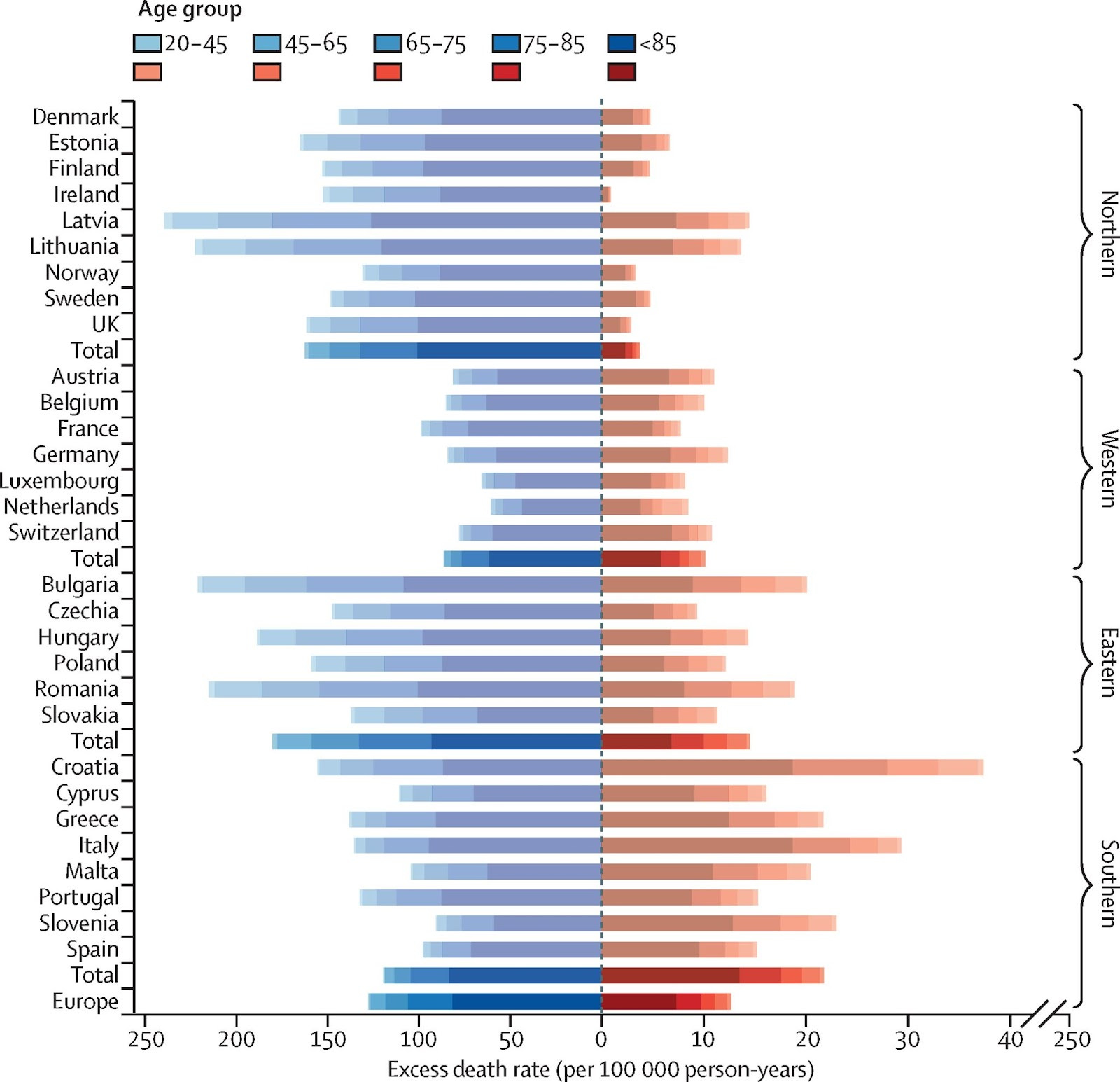
Figure: Country-level cold (in blue) and heat (in red) annual raw death rates broken down by age group
A cursory look at the graph would suggest deaths attributed to the cold (blue) are more numerous than deaths attributed to heat (red), but for some countries, for southern European countries, and some individual countries (eg Germany and Croatia), the rates appear similar. A closer look reveals the problem - the x-axis scale for the blue bars (cold) is not the same as the scale for the red bars (heat). Tick marks for the left hand side of the graph occur every 50 deaths per 100,000 person-years and every 10 deaths for the right-hand side. One of the purposes of the graph is to compare heat and cold yet the graph presents a distorted view of that. The lie-factor of this graph is 5 - heat deaths occupy five times more space on the graph than they should and this creates a false impression - a lie. That this escaped the attention of all of the authors (17 of which have PhD’s), the reviewers, copy-editors and editorial board of the journal baffles me!
I am not surprised at all. The biomedical journals have been captured by far left interests.